
13 Warm Neutral Paint Colors for Cozy Homes
Greige had a good decade-long run before the backlash arrived. Design writers started calling it flat, lifeless, the paint equivalent of a beige rental unit trying to look expensive.
The actual problem was never neutrals themselves. It was a specific narrow band of cool-leaning gray-beige used almost everywhere, in almost every listing photo, until an entire generation of buyers could recognize it on sight and started actively avoiding it.

Warm neutrals solve the exact fatigue greige created, without asking anyone to commit to a bold, saturated color they might tire of within a year. The undertone shifts from cool gray toward genuine warmth, amber, clay, honey, and that shift alone changes how a room feels far more than the actual lightness or darkness of the color does.
Here are 13 warm neutral paint colors that deliver genuine coziness without falling back into the same flat gray-beige everyone’s grown tired of.
Why warmth in a neutral matters more than most people initially realize
The undertone does most of the emotional work, even in colors that read as essentially the same shade from a distance.
- Warm undertones, yellow, red, or orange-based, reflect light in a way that makes skin tones and wood finishes look more flattering than a cool-toned equivalent
- A room’s actual light exposure changes how any paint color reads throughout the day, and warm neutrals specifically tend to hold their coziness better under both natural and artificial light
- The difference between a warm and cool neutral often isn’t visible in isolation, but becomes obvious the moment the two are compared side by side in the same room
Once you start testing paint specifically for undertone rather than just overall lightness, the right warm neutral becomes considerably easier to identify.
1. Soft Camel
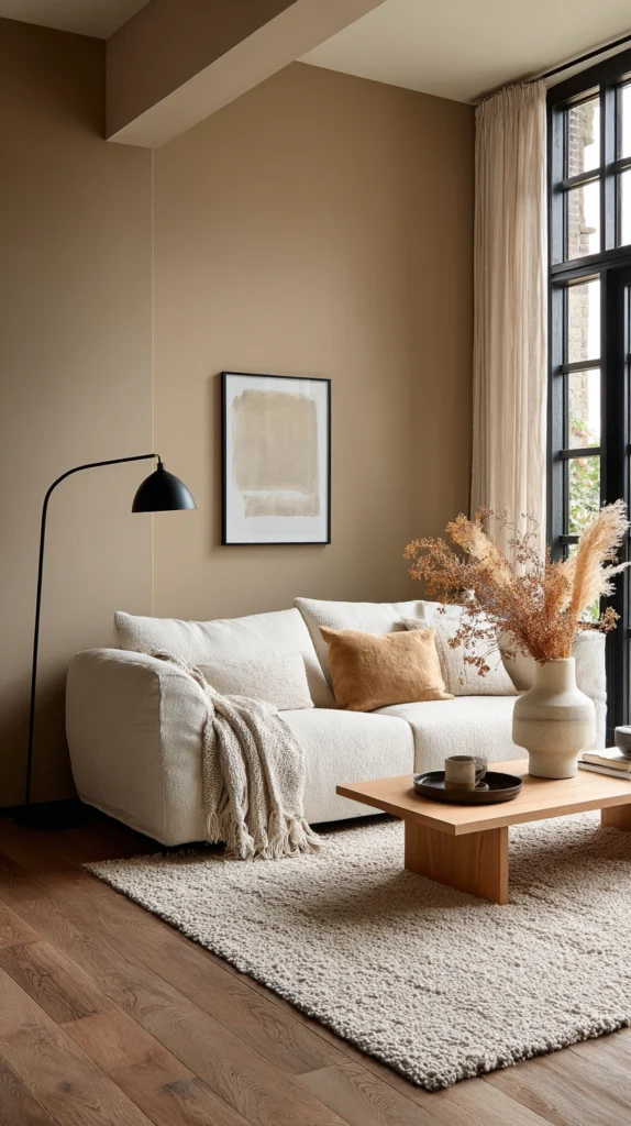
A warm, mid-tone neutral leaning gently toward tan.
Why it works for a cozy home:
- It reads as genuinely warm without tipping into an obviously orange or overly saturated tone
- It pairs naturally with both black and brass hardware, giving considerable flexibility in fixture and furniture choices
- It holds its warmth consistently across both bright daylight and warmer evening lamp light, unlike some neutrals that shift noticeably cooler under artificial lighting
Where it suits the home best:
Soft camel works particularly well in living rooms and primary bedrooms, where its mid-tone depth adds warmth without darkening the room the way a deeper color might. It also suits north-facing rooms specifically well, since its warmth helps counteract the naturally cooler light these rooms tend to receive throughout the day.
2. Warm Ivory
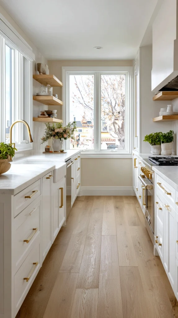
A pale, creamy neutral with a genuine yellow undertone.
Why it works for a cozy home:
- It delivers much of the brightness benefit of a stark white while avoiding that color’s tendency to feel clinical or cold
- The subtle yellow undertone becomes especially noticeable and flattering under warm-toned lamp light in the evening
- It serves as an excellent trim and ceiling color specifically, since it reads as bright and clean without the harshness a cooler white can introduce against warmer wall colors
Where it suits the home best:
Warm ivory suits kitchens and bathrooms particularly well, rooms that often benefit from a brighter base color but can feel sterile with a true, cool-toned white. It also works effectively as a whole-house trim color, tying together a variety of warmer wall colors used throughout different rooms.
3. Terracotta Clay
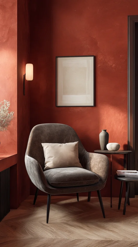
A muted, earthy orange-red neutral with genuine depth.
Why it works for a cozy home:
- Despite reading as more of a color than a true neutral, a muted clay tone functions similarly to a neutral in how flexibly it pairs with other colors and materials
- It brings genuine warmth and richness to a room, evoking sun-baked earth and Mediterranean or Southwestern design traditions
- It photographs beautifully under warm, low evening light, making rooms painted this color feel especially inviting after dark
Where it suits the home best:
Terracotta clay works well as an accent wall in a living or dining room, or as a full-room color in a smaller space like a powder room or reading nook, where its intensity can be fully appreciated without overwhelming a larger, more frequently used room.
4. Warm Greige With a Yellow Base

A specific reformulation of the popular gray-beige, adjusted toward genuine warmth.
Why it works for a cozy home:
- It retains greige’s popular versatility and neutrality while shifting away from the cool undertone that led to the color’s broader fatigue and backlash
- It pairs well with both warm wood tones and cooler metal finishes, offering more flexibility than a more strongly warm-toned color might
- It tends to photograph well for real estate and design purposes, since it splits the difference between a fully neutral gray and a more clearly warm tan
Where it suits the home best:
This specific warm-leaning greige suits open-concept living spaces particularly well, where its adaptability allows it to read appropriately whether paired with a kitchen’s cooler stainless appliances or a living room’s warmer wood furniture nearby.
5. Honey Oak
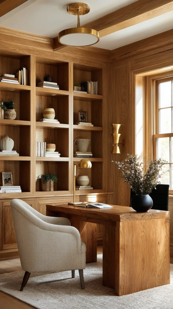
A warm, golden-brown neutral inspired by natural wood tones.
Why it works for a cozy home:
- It directly echoes the warmth of natural oak and other honey-toned woods, creating genuine cohesion in rooms with substantial wood flooring or furniture
- The golden undertone adds a sense of warmth and richness without reading as a bold or particularly saturated color choice
- It works effectively as either a full wall color or a stained wood tone reference point when selecting furniture and trim to coordinate with an existing warm neutral wall
Where it suits the home best:
Honey oak suits home offices and libraries especially well, spaces that often already lean toward wood furniture and built-in shelving, since the wall color reinforces rather than competes with that existing warm wood palette.
6. Soft Blush Beige
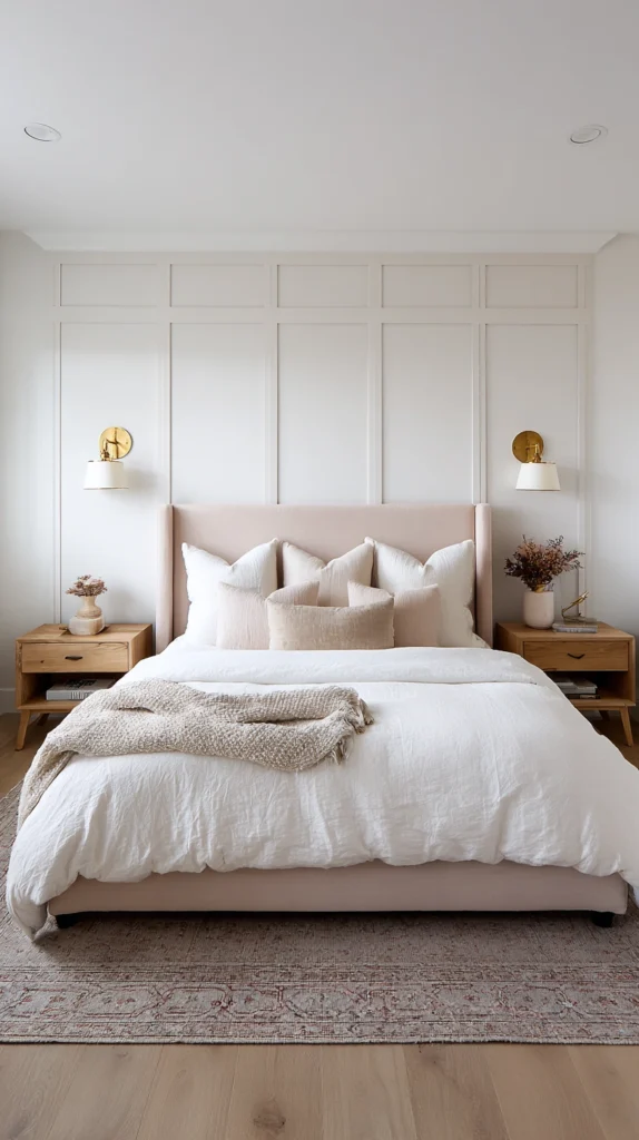
A neutral with a very subtle pink undertone alongside its primary warm base.
Why it works for a cozy home:
- The faint pink undertone adds a gentle warmth and softness that reads as considerably more inviting than a starker, flatter beige
- It flatters skin tones particularly well, making it a strong choice for bathrooms and bedrooms where lighting and mirror use matter more than in other rooms
- It pairs beautifully with both brass and rose gold hardware, reinforcing its inherently soft, warm character
Where it suits the home best:
Soft blush beige works especially well in primary bathrooms and bedrooms, where its flattering quality under both natural and artificial light provides a genuine functional benefit alongside its aesthetic appeal.
7. Warm Taupe
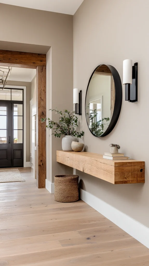
A mid-tone neutral balancing brown and gray with a warm lean.
Why it works for a cozy home:
- It offers a slightly more sophisticated, muted alternative to a straightforward tan or camel, while still reading as genuinely warm rather than cool
- Its balanced quality means it works well in rooms with mixed metal finishes or a variety of wood tones, since it doesn’t compete strongly with any single existing color
- It provides a strong backdrop for both bold and neutral furniture choices, adapting easily as decor changes over time
Where it suits the home best:
Warm taupe suits entryways and hallways particularly well, transitional spaces that benefit from a versatile, adaptable color capable of working alongside whatever specific colors exist in the rooms branching off from it.
8. Buttercream
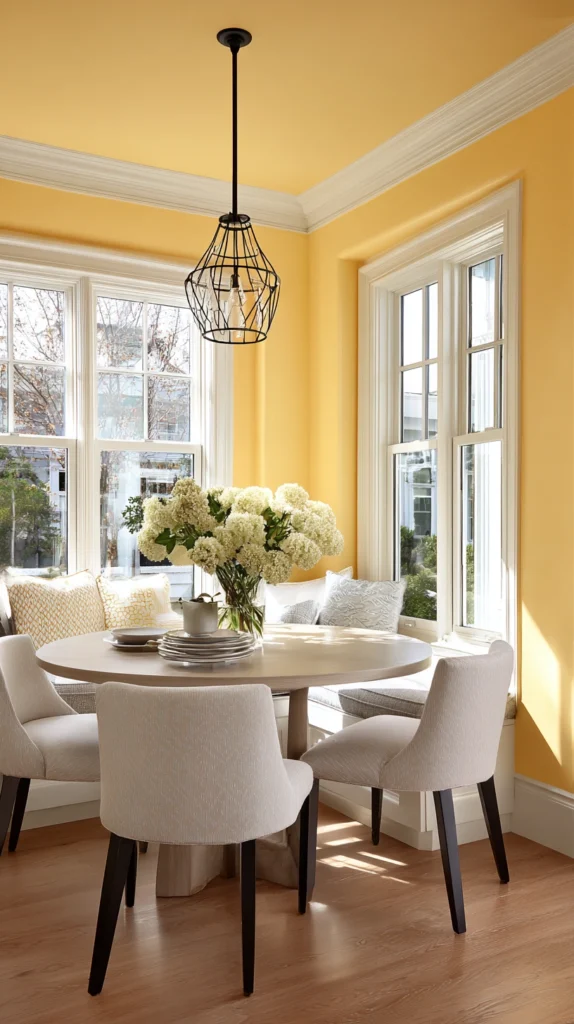
A pale, warm yellow-neutral with a genuinely soft quality.
Why it works for a cozy home:
- It introduces a hint of cheerful warmth without becoming a fully committed yellow, keeping the color functioning more like a soft neutral than a bold statement
- It brightens a room considerably, making it a strong choice for spaces with limited natural light that still want to avoid feeling cold or sterile
- It pairs naturally with both wood tones and white trim, offering a soft, comfortable base for a wide range of decor styles
Where it suits the home best:
Buttercream suits kitchens and breakfast nooks especially well, rooms that benefit from a bright, cheerful quality during the specific morning hours these spaces often see the most use.
9. Warm Charcoal

A deep neutral that leans brown rather than blue-gray.
Why it works for a cozy home:
- It delivers dramatic depth and richness without the coldness a blue-based charcoal or true black can introduce into a room
- The warm undertone keeps a genuinely dark color from feeling harsh, making it more approachable for someone hesitant about committing to a deep, saturated wall color
- It pairs exceptionally well with warm brass hardware and lighting, since both elements share the same underlying warm color family
Where it suits the home best:
Warm charcoal suits home offices, dens, and dining rooms particularly well, spaces often used in the evening where a deeper, moodier color choice genuinely suits the room’s typical use and lighting conditions.
10. Warm White With a Cream Undertone
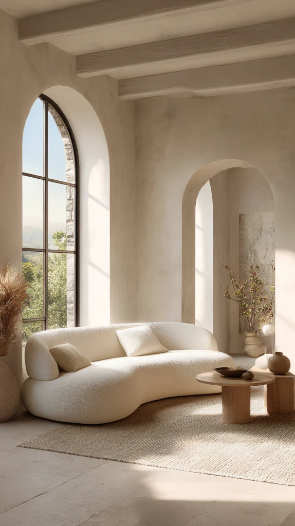
A white paint specifically formulated with enough underlying warmth to avoid a stark, clinical read.
Why it works for a cozy home:
- It provides much of the brightness and light-reflecting quality people want from a white paint, without the cool, sterile feeling a blue-based white can introduce
- It serves as an excellent whole-house color for anyone wanting a light, airy palette throughout, without the fatigue risk that stark white can eventually create
- It photographs particularly well in natural light, since its warm undertone becomes more visible and flattering the more daylight the room receives
Where it suits the home best:
This specific warm white suits any room where a genuinely light, bright palette is the goal, but works particularly well throughout a whole open floor plan, where its consistent warmth ties multiple connected spaces together cohesively.
11. Sienna Brown
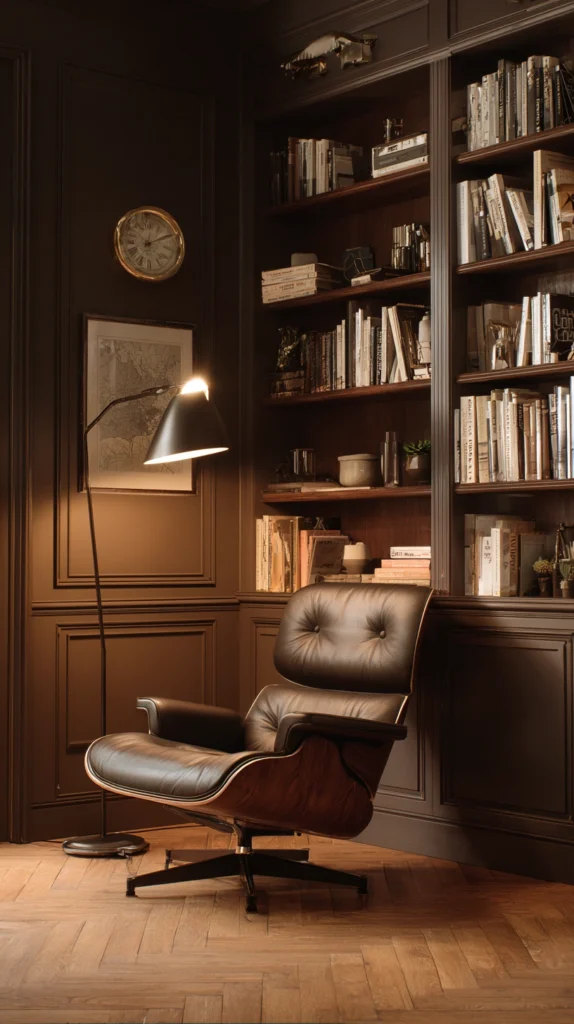
A rich, reddish-brown neutral with genuine depth and warmth.
Why it works for a cozy home:
- It brings the depth and richness of a true brown while retaining enough red-orange warmth to avoid feeling flat or muddy
- It suits traditional and rustic interiors particularly well, echoing the tones found in natural leather, aged wood, and other classic material choices
- It works effectively as an accent color in smaller doses, like a single wall or a piece of furniture, for anyone not ready to commit to it as a full-room color
Where it suits the home best:
Sienna brown suits libraries, studies, and more traditionally styled living rooms especially well, spaces that already lean toward leather furniture and warm wood tones the color naturally complements.
12. Warm Sand
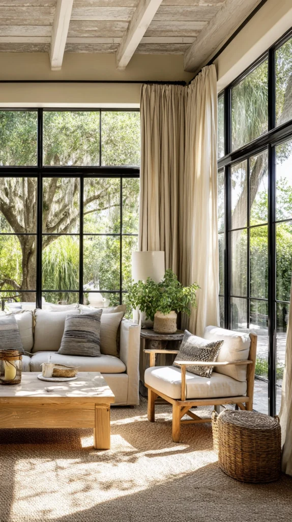
A pale, warm neutral evoking beach sand rather than gray stone.
Why it works for a cozy home:
- It carries genuine warmth without becoming as saturated or attention-demanding as a deeper tan or camel
- Its light, airy quality suits coastal and relaxed, casual interior styles particularly well, while still functioning as a genuinely versatile neutral elsewhere
- It works effectively alongside both warm and cooler accent colors, since its own pale, understated quality doesn’t compete strongly with whatever else is introduced into the room
Where it suits the home best:
Warm sand suits sunrooms and casual living spaces particularly well, rooms that benefit from a relaxed, light palette without needing the drama or intensity of a deeper warm neutral elsewhere in the home.
13. Aged Brass Gold
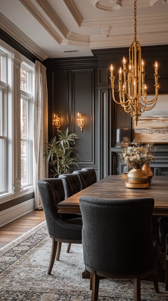
A muted, deep gold neutral with genuine sophistication.
Why it works for a cozy home:
- It introduces genuine richness and warmth without the more casual, rustic feeling some of the lighter warm neutrals on this list carry
- The muted, aged quality keeps the color from reading as overly bright or costume-like, instead suggesting genuine depth and history
- It pairs beautifully with dark wood furniture and warm metal accents, reinforcing an overall sense of considered, elevated warmth
Where it suits the home best:
Aged brass gold suits formal dining rooms and powder rooms especially well, smaller or more occasionally used spaces where a deeper, richer color choice can deliver real drama without needing to function as an everyday, highly livable neutral throughout the whole home.
Testing Any Warm Neutral Before Committing to a Full Room
A quick reference for the testing process worth doing regardless of which specific color from this list you’re considering.
| Step | What to Do | Why It Matters |
| 1 | Paint a large swatch, at least two feet square, directly on the wall | Small chips distort how a color actually reads at full scale |
| 2 | View the swatch at multiple times of day | Warm neutrals can shift noticeably between morning, midday, and evening light |
| 3 | Check the swatch under both natural and artificial lighting | A color that looks warm in daylight can occasionally read cooler under certain bulb temperatures |
| 4 | Compare the swatch against existing flooring and major furniture | Undertone clashes are far easier to spot before a full room is painted than after |
| 5 | Live with the swatch for at least a few days before deciding | Paint colors often look different once initial excitement settles into how the room actually feels daily |
Getting started this weekend
You don’t need to choose a whole-house color scheme before making genuine progress on this project.
- Start by testing two or three colors from this list in the specific room bothering you most, painting large swatches rather than relying on small chips
- Add trim and hardware considerations once the wall color is confirmed, since metal finish and trim white both interact with the wall’s specific undertone
- Save a whole-house repaint for once you’ve confirmed a single room’s color genuinely holds up across different lighting conditions over several days
Most homes that successfully shift away from the flat, fatigued greige default do so by testing specifically for undertone, not just overall lightness, before committing to a full room.
Budget reality
Warm neutral paint projects scale affordably regardless of which specific color is chosen.
- Under $50: Sample-sized paint pots and swatch testing supplies for a few colors under consideration
- $50-150: A single accent wall or small room, like a powder room or entryway
- $150-400: A full room repaint, including primer and trim work
- $400+: A whole-house repaint carrying one consistent warm neutral thread through multiple connected rooms
Most of the impact comes from choosing the right undertone for the specific room’s light and existing materials, not from the price of the paint itself.
What actually makes a warm neutral feel cozy rather than flat
It was never really about avoiding gray entirely.
It’s the undertone tested honestly against the room’s actual light, the color chosen to flatter the existing wood floors and metal hardware rather than fight against them, the warmth that holds up consistently from morning daylight through evening lamp light instead of shifting cold the moment the sun goes down.
Test for undertone specifically, live with the swatch before committing, and the right warm neutral ends up feeling like the room was always meant to be that color.