
How to Style a Modern Minimalist Thanksgiving Table
Say “Thanksgiving table” and most people picture the same default: a cornucopia spilling gourds across a burnt-orange runner, mismatched harvest-themed napkin rings, maybe a ceramic turkey standing guard at the center.
None of that is required. Thanksgiving’s actual meaning, gratitude, gathering, a shared meal, has nothing to do with a specific color palette or a particular craft-store decoration style. A minimalist table can honor the day just as fully, often with more visual clarity than a table trying to include every traditional autumn motif at once.

A modern minimalist Thanksgiving table relies on restraint, quality materials, and a tight color palette rather than volume of decoration. Done well, it looks intentional rather than sparse, elevated rather than cold.
Here are 10 ways to build that specific table, one that feels genuinely considered without leaning on a single traditional harvest cliché.
What actually defines a minimalist approach to this specific holiday table
The style asks different questions of a Thanksgiving table than the traditional version does.
- A tight, disciplined color palette does more work than a wide range of seasonal colors competing for attention
- Negative space becomes a genuine design choice, not an accident of insufficient decorating
- Quality of materials, real linen, natural wood, substantial ceramics, matters more here than quantity of decorative objects
Once the palette and material choices are locked in, the rest of the table’s styling becomes a matter of careful editing rather than continuous adding.
1. Choose a Single Neutral Color Story Instead of a Full Autumn Palette

Replacing the traditional orange, red, and brown mix with one cohesive tone.
Build it:
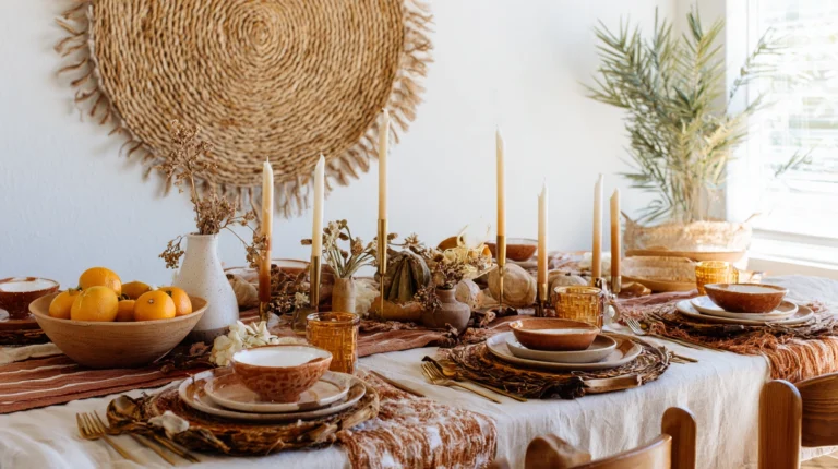
- A single neutral family, like warm ivory, soft sage, or muted terracotta, applied consistently across the tablecloth, napkins, and any ceramic pieces
- Traditional harvest colors avoided entirely, or reduced to a single, very subtle accent rather than a full competing palette
- Texture introduced through material variation within the same color family, rather than through additional colors
Why a single color story suits the minimalist approach better than the traditional full autumn spectrum:
- It immediately signals a different aesthetic direction than the expected Thanksgiving default, without requiring any explanation
- A tight palette photographs and lives considerably more calmly than a table competing with orange, brown, red, and gold all at once
- It gives every other styling decision, from florals to place settings, a clear boundary to work within, simplifying the rest of the planning process
Why choosing a genuinely neutral base, rather than simply a muted version of traditional fall colors, matters for the final result:
A muted burnt orange or dusty brown still reads as a traditional fall palette, just quieter, which doesn’t fully achieve the intended minimalist shift. Choosing a color genuinely outside the expected autumn range, like a cool sage, a warm ivory, or even a soft gray, more clearly signals the deliberate departure from convention this specific style is built around.
Cost breakdown: A new neutral tablecloth and napkin set runs $60 to $150 depending on fabric quality.
2. Use a Single Type of Linen Throughout

Committing to one fabric rather than mixing several different textile types.
Build it:
- Heavyweight linen chosen for the tablecloth, napkins, and any runner, all in the exact same fabric and color
- Pressed lightly rather than heavily starched, allowing linen’s natural texture and slight wrinkle to remain visible
- No pattern introduced anywhere in the textile choices, letting the linen’s inherent texture carry the visual interest instead
Why a single linen type throughout creates more cohesion than mixing fabrics:
- It removes an entire layer of potential visual complexity, since there’s no need to coordinate between different fabric weights, textures, or subtle color variations
- Linen’s natural texture provides genuine visual interest on its own, without needing a printed pattern to avoid looking flat
- It reinforces the minimalist principle of restraint, applying the same disciplined, single-choice approach to textiles that the color palette already established
Why avoiding starch matters more in this specific styling context than it might for a more traditional formal table:
Heavily starched, perfectly pressed linen can read as overly formal and rigid, working against minimalism’s underlying appreciation for natural material and honest texture. Allowing linen to retain some of its natural, relaxed wrinkle keeps the whole table feeling calm and genuine rather than stiff, which suits the overall aesthetic considerably better than a table ironed into complete uniformity.
Cost breakdown: Quality linen tablecloth and napkin sets run $80 to $200 depending on size and specific linen weight.
3. Build a Low, Sculptural Centerpiece Instead of a Cornucopia
Replacing the traditional overflowing horn-shaped arrangement with something considerably more restrained.
Build it:
- A single sculptural element, like a smooth ceramic vessel, a piece of driftwood, or a small cluster of dried pampas grass, positioned centrally
- Kept genuinely low, well beneath eye level for seated guests, maintaining clear sightlines across the table
- No traditional gourds, mini pumpkins, or harvest-themed figurines included anywhere in the arrangement
Why a single sculptural piece suits minimalism better than a traditional abundant harvest display:
- It gives the eye one clear focal point rather than the visual business of a cornucopia’s typically overflowing, densely packed arrangement
- The restrained, sculptural quality photographs considerably more calmly, aligning with the overall aesthetic’s preference for negative space
- It can be sourced as a genuinely reusable decor piece, unlike traditional harvest decorations that see use for only one specific holiday each year
Why choosing an object with genuine sculptural quality, rather than simply a smaller traditional decoration, matters for this specific approach:
Simply using a miniature cornucopia or a single small pumpkin doesn’t achieve the intended minimalist effect, since the object itself still carries the traditional harvest association regardless of its reduced size. Choosing something with genuine sculptural interest on its own terms, independent of any Thanksgiving-specific symbolism, keeps the centerpiece feeling like an intentional design object rather than simply a scaled-down version of the traditional default.
Cost breakdown: A sculptural centerpiece object runs $30 to $100 depending on the specific material and source.
4. Choose Dinnerware in a Single Uniform Color
Moving away from patterned or harvest-themed china toward a genuinely simple palette.
Build it:
- Plain white, cream, or a single solid stoneware color used consistently across every place setting
- No seasonal patterns, like painted leaves or turkeys, anywhere on the dinnerware itself
- Varying plate sizes and slight textural differences, like a matte versus glossy finish, used to add subtle visual interest within the otherwise uniform color choice
Why uniform, unpatterned dinnerware suits this specific table style more than traditional seasonal china:
- It keeps the table’s visual attention on the food itself and the overall composition, rather than competing with a busy printed pattern on every plate
- A single consistent color across all place settings reinforces the same disciplined restraint established by the linen and centerpiece choices
- It’s genuinely versatile beyond just this one holiday, unlike seasonal harvest-patterned china that sees use for only a few weeks each year
Why subtle textural variation, rather than complete uniformity, keeps this choice from feeling sterile:
Using dinnerware that’s not just the same color but also entirely identical in texture and finish across every single piece can occasionally read as slightly cold or clinical rather than warm and inviting. Introducing small variation, like a matte charger beneath a glossy dinner plate, or a slightly different stoneware texture for the bread plate, maintains visual interest and warmth while still honoring the overall commitment to a single color story.
Cost breakdown: A set of simple, uniform dinnerware runs $80 to $250 depending on quality and place setting count.
5. Use Unscented or Subtly Scented Taper Candles in a Single Color

Choosing candlelight that matches the table’s restrained overall palette.
Build it:
- Taper candles in the exact same neutral tone established by the tablecloth and dinnerware, rather than a traditional harvest orange or red
- Simple, unadorned candle holders, ideally in a single matching or complementary material like brass or plain ceramic
- Positioned in a single straight line or a very simple cluster, avoiding an elaborate, densely arranged candelabra style
Why matched-tone candles reinforce the table’s overall cohesion more effectively than traditional seasonal colors:
- It extends the single-color-story principle all the way down to the lighting, rather than allowing candle color to introduce an unplanned additional hue
- Simple, unadorned holders keep the focus on the candlelight itself and the flame’s warm glow, rather than an ornate holder competing for attention
- A restrained, simply arranged row of candles suits the overall minimalist aesthetic better than a dense, traditional candelabra arrangement
Why choosing genuinely simple candle holders matters as much as the candle color itself:
An ornately detailed or heavily embellished candle holder can undercut an otherwise carefully restrained table, since its visual complexity works directly against the minimalist principle guiding every other decision. Choosing holders with clean, simple lines, in a material and finish that echoes something else already on the table, like a matching metal tone in the flatware, keeps this element consistent with the table’s overall disciplined approach.
Cost breakdown: A set of matched-tone taper candles and simple holders runs $30 to $70 depending on quantity and holder material.
6. Fold Napkins in a Single Simple Shape Repeated at Every Setting

Choosing restraint in presentation over an elaborate or varied napkin folding technique.
Build it:
- A single clean fold, like a simple rectangle or a loose roll, applied identically at every single place setting
- No decorative napkin rings, ribbons, or tucked florals added, letting the linen’s natural texture stand alone
- A small, simple accent, like a single sprig of rosemary or a plain place card, added only if genuinely necessary rather than as a default addition
Why napkin simplicity matters as much as any other individual table element:
- A repeated, identical fold across every setting reinforces the sense of order and intentional restraint the whole table is built around
- Avoiding decorative rings and ribbons keeps this detail from introducing unplanned color or pattern that would work against the established palette
- It’s one of the easiest individual elements to execute consistently, requiring no specialized folding skill or additional purchased accessories
Why resisting the urge to add a decorative accent at every single place setting produces a more successful minimalist result:
It’s tempting to add just one small decorative touch, like a sprig of greenery or a ribbon, to every napkin, but doing so at every single place setting can inadvertently recreate the same layered, accumulated feeling minimalism is specifically trying to avoid. If an accent is used at all, applying it more sparingly, perhaps only at every other place setting or only for the head chairs, maintains a stronger sense of restraint than defaulting to the same small addition repeated at every single spot.
Cost breakdown: Free beyond the linen napkins already accounted for elsewhere in the table’s overall styling.
7. Choose Flatware in a Single Matte Metal Finish
Selecting hardware that reinforces the table’s overall material discipline.
Build it:
- A full flatware set in a single matte finish, like brushed brass, matte black, or brushed steel, avoiding a bright, polished shine
- No ornate handle detailing or engraved patterns, keeping the silhouette as clean and simple as the rest of the table’s elements
- The same metal finish echoed in the candle holders or any other metal accents on the table, reinforcing overall consistency
Why matte metal finishes suit this table style more than traditional polished silver:
- The subdued, non-reflective quality of a matte finish suits the table’s overall calm, restrained visual language better than a bright, attention-drawing shine
- A single consistent metal tone across flatware and any other metal accents ties the whole table setting together more effectively than mixed or unconsidered metal choices
- It photographs with less glare and reflection than polished silver, an increasingly relevant consideration given how frequently holiday tables get documented in photos
Why consistency in metal finish across every metal element on the table matters more here than in a more traditionally styled setting:
A traditional table can sometimes get away with mixing silver flatware, gold candle holders, and a bronze centerpiece without it reading as a significant misstep, since the table’s overall visual complexity already includes many competing elements. A minimalist table, with so few individual pieces carrying visual weight, makes any inconsistency in metal tone considerably more noticeable, meaning this specific detail deserves more careful, deliberate coordination than it might in a busier, more traditional table setting.
Cost breakdown: A matte-finish flatware set runs $60 to $200 depending on place setting count and specific material.
8. Limit the Table’s Total Object Count Deliberately
Applying a genuine numerical discipline to how many individual items appear per place setting.
Build it:
- A firm mental limit, like four or five total objects per place setting, including the plate, napkin, flatware, and glassware
- Any additional item considered only if something else is removed to make room for it, rather than simply adding on top of what’s already there
- The same restraint applied to the table’s overall centerpiece and any additional styling elements beyond the individual place settings
Why a genuine object count limit produces a more successful minimalist result than a general intention toward restraint:
- A specific, concrete limit is easier to actually maintain in practice than a vague goal of “keeping things simple,” which can drift as more items get added throughout the planning process
- It forces genuinely deliberate choices about what actually earns a place at each setting, rather than defaulting to including every traditionally expected item
- It keeps the whole table’s visual density consistently restrained, rather than allowing one particularly enthusiastic styling decision to undercut the overall discipline established elsewhere
Why setting this limit before starting to shop or gather materials, rather than after, changes the whole planning process for the better:
Deciding on a specific object limit only after already accumulating various table styling items tends to result in difficult, retroactive editing decisions, since it’s harder to remove something already acquired and prepared than to simply not acquire it in the first place. Establishing the numerical limit at the very start of the planning process, before any specific purchases or gathering happens, naturally guides every subsequent decision toward the intended restraint rather than requiring a difficult culling process later.
Cost breakdown: Free, since this is a planning principle applied throughout the process rather than a specific purchase.
9. Use Natural Wood or Stone Chargers Instead of Decorative Ones

Introducing texture through raw material rather than a patterned or embellished charger plate.
Build it:
- A simple wood or stone charger beneath each place setting, left in its natural finish rather than painted or heavily varnished
- Positioned consistently at every single setting, reinforcing the sense of order established elsewhere on the table
- Chosen in a tone that complements the tablecloth and dinnerware without introducing an entirely new competing color
Why natural material chargers suit this table better than a traditional decorative charger:
- Wood grain and stone veining provide genuine textural interest without requiring any applied pattern or embellishment
- It reinforces the overall preference for honest, natural materials found throughout minimalist design more broadly, not just at the Thanksgiving table specifically
- It adds a grounding, earthy element beneath the more refined linen and dinnerware, balancing the table’s overall material story
Why choosing a charger tone that harmonizes with, rather than contrasts sharply against, the rest of the table matters for overall cohesion:
A charger in a strongly contrasting wood tone or stone color, even if each individual element is beautiful, can inadvertently introduce a color the rest of the table’s careful palette planning didn’t account for. Testing the specific charger against the tablecloth and dinnerware together before finalizing the choice, rather than selecting it in isolation, ensures this element supports rather than disrupts the table’s overall considered color story.
Cost breakdown: Natural wood or stone chargers run $40 to $100 for a full set depending on material and place setting count.
10. Leave Genuine Negative Space Across the Table’s Surface
Treating empty space itself as a deliberate design choice rather than an oversight.
Build it:
- A conscious decision to leave visible bare tablecloth between the centerpiece and individual place settings, rather than filling every available inch
- Additional decorative objects removed if the table starts to feel crowded, even if those objects are individually attractive
- The same principle applied to the room around the table, keeping surrounding surfaces like a sideboard or mantel similarly restrained rather than densely decorated
Why negative space does more to define this style than any single decorative choice:
- Genuine empty space is what most clearly distinguishes a minimalist table from a simply smaller-scale traditional one, since restraint in spacing matters as much as restraint in color or object count
- It gives every remaining styled element more visual weight and attention, since nothing is competing with it for the same limited surface area
- It extends the same design principle used throughout modern minimalist interiors more broadly into the specific context of holiday table styling
Why this final step often requires deliberately removing something, rather than simply not adding more:
After following all the other principles in this list, it’s still possible to end up with a table that feels slightly more filled than genuinely minimalist, simply because each individual choice seemed reasonable and restrained on its own. Stepping back and looking at the whole table as a complete composition, then removing one more object even if everything currently on the table seems individually justified, often produces the more successfully restrained final result this whole approach is built around.
Cost breakdown: Free, and often the single most important step in the entire styling process.
Getting started this weekend
You don’t need every element sourced and finalized before making genuine progress on this table.
- Start by choosing the single neutral color palette that will guide every other decision, testing it against your actual dining room’s lighting
- Add the linen and dinnerware choices once the palette feels settled, checking that both stay within the same tight color family
- Save the centerpiece and final styling for closer to the actual holiday, applying the negative space principle as a final check before guests arrive
Most modern minimalist Thanksgiving tables that succeed do so because the palette and material discipline were established first, with every subsequent decision simply following that already-set direction rather than introducing new, competing choices along the way.
Budget reality
A modern minimalist Thanksgiving table can be built at a range of budget levels, since the style relies more on discipline than on expensive materials.
- Under $100: A neutral tablecloth and napkin set, a simple sculptural centerpiece object, taper candles in a matched tone
- $100-300: Uniform dinnerware, matte-finish flatware, natural wood or stone chargers
- $300-500: A full combination of quality linen, dinnerware, and flatware all sourced new and coordinated together
- $500+: A complete table refresh including new furniture-adjacent elements like a runner, chargers, and coordinated glassware across a larger guest count
Most of the visual success comes from the discipline applied to color and object count, not from the total amount spent on any individual element.
What actually makes a Thanksgiving table read as modern and minimalist

It was never really about removing every trace of the holiday’s traditional warmth.
It’s the single color story carried consistently from the tablecloth to the candlelight, the sculptural centerpiece replacing the expected cornucopia, the negative space left deliberately open so the few chosen elements actually get seen.
Choose the palette first, apply real restraint to everything that follows, and the table ends up feeling genuinely considered rather than simply pared down from a more traditional version of the same holiday.